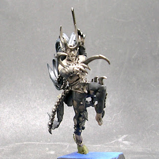
Another quick post. Had this guy almost completely finished except for a final wash for quite some time. No idea why I put it off for so long, but I got around to it a while back, and then the pics languished on my HD for a while. Pretty sure I knocked him out right at the end of December, so he doesn't count toward my total for 2019.
I wanted to go for a similarly extreme look as the Mistweaver Saih, but in the opposite direction, other than the skin. I think I only used Rakarth Flesh, Eshin Grey, Dark Reaper (hair), and Leadbelcher, and the Army Painter Dark Tone for the wash. Oh, and Screaming Skull or something for the bird skull on his belt, and I think Deathworld Forest for the little vine he's leaping from.
As is often the case, the combination of the camera and the harsh lighting change things up a bit in these pics, but not much. The extra shade on his left foot isn't really noticeable in person, for instance. I'm really happy with the result, tho, both in general and as a contrast with my Mistweaver Saih. Until next time, y'all have a good one, y'hear!


For some reason, we never played the Shard in our games. I had to go and check my copy to ensure that he was in the starter set and not added later. Can't see anything wrong with his rules and he looks totally badass. Weird how things just drop off your radar. Thanks for reminding me and I love your version. His base colour is an odd choice for the moody greys and storm cloud tones tho. Are you tying it in with other models?
ReplyDeleteYeah, he's pretty brutal. Thanks!
DeleteThe basing on these is kind of a mess. My original plan was to do them all in this blue, as a suitable Tzeentchian colour to represent the floor in the Silver Tower. Maybe with some freehand gold detail. But then more and more of them started coming out with rules for AoS and/or 40K, so I started basing those like my regular Armies, and never got around to doing anything fancier with the few that were left only really usable in Silver Tower.
Basing...yeah I often go simpler is better on that front. That's the one part of the mini that I hate doing...
DeleteI really like the washed out look!
I actually really like doing bases. But this seemed like the option to go for at the time.
DeleteVery nice work. You've done a great job with the subdued palette on him.
ReplyDeleteThanks! I find with a lot of GW's Models, there's so much detail on there that it can be easy to get carried away making sure everything is distinct and taking forever with it. It's nice sometimes to set restrictions like this for myself and see how well things can come out within that framework.
DeleteVery nice :) . You’ve used a very muted palette but it has worked very well. It’s a really great model, lots of movement to him with the pose and flowing hair
ReplyDeleteThanks! The simple scheme certainly shows off the strength of the sculpt.
ReplyDeleteThat is one sweet looking model.
ReplyDeleteSilver Tower was always one of those games that bypassed me but every model I've seen from this game has always appealed to me....and this one is no exception.
Great work!
Thanks! It was one of the first times the sculptors really started moving past the restrictions imposed by everything needing to rank up, and they did some fantastic work as a result. The only Model from it that I don't like is the Fyreslayer, and that's just because I don't like the Fyreslayer aesthetic, not because of anything inherent to that Model.
Delete